Thursday, 25 February 2016

Evaluation Question 2) How does your media product represent particular social groups?

To find our reader profile, we used a website called survey monkey, this allowed us to survey people and get some vital information on who would read our magazine and what they would be expecting from the final product.  Here is my survey:

From this survey, I found that:
I used this information as a basis of what to include in my magazine, and this impacted a lot on what my pieces looked like, for example, because the most favoured artist was Ed Sheeran, so I researched past magazines which Ed had done and used that as inspiration for mine. Another way the product was influenced by this information was the free gifts section as I included a free CD as a free gift. 

Evaluation Question 1) In what ways does your media product use, develop or challenge forms and conventions of real media products?

Evaluation question 1

My piece follows a lot of conventions of a music magazine, however, I do feel it breaks some conventions. 
Cover: My cover follows the 'common' conventions, for example, the masthead, main image, cover lines, and the plug, however it does defy some conventions, for example the main image, the person photographed is not looking directly at the camera, this is because I wanted the cover to be a little edgy, also, I took several elements of other covers to create mine, and I used an issue of 'Q' as a Base for my my main image, on the edition of 'Q' it shows Ed Sheeran looking away from the camera which I felt worked, well and tried to emulate some of this. 


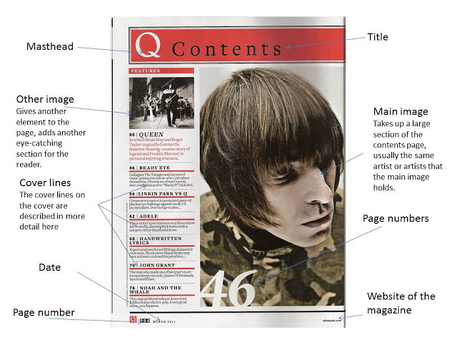
My contents page I feel strays the furthest away form the general conventions of a music magazine, even though it has several of the conventions typically on a contents page, it is layed out totally differently. It still has the main image, but it is slightly smaller than it should be, so it will be made slightly bugger, to actually dominate the page, and the amount of contents listed could be scaled down.


My double page spread follows the more common layout of what a double page spread looks like, for example it has all of what you would expect to see on a double page spread, such as the main image, quotes from the artist and the layout is stereotypical to a double page spread. 


Friday, 29 January 2016

Contents page & DPS Guidelines

Contents page:
  • Multiple images (Four original images on the contents page at least)
  • Contents page should reflect cover stories
  • Largest image should be the cover star
  • Not all contents is on the contents page
  • Weekly = 60 pages
  • Monthly = 140-180 pages
  • Divided into sections
  • Page number = 6 upwards
  • Elements to include:
    • Subscription offer
    • Letter from editor
    • Magazine branding (Colour and Logo's)
DPS:
  •  A3 Landscape, 300 DPI
  • Page numbers: Weekly=40s, Monthlys=100's
  • Big letter at the begining of the paragraph (Dropped Cap)
  • Pull out quote
  • Columns
  • Use photoshop for graphics, headlines and photos 
  • Publisher for columns of text
  • Column = No less than 6 words, no more than 12

Thursday, 26 November 2015

18th December Deadline Plan

By Dec 3rd

Complete google mock-ups for front cover, DPS and contents page

December 9th-11th

All original photography taken
Placing them into the front cover

Dec 11th
Front cover on my blog

Thursday, 1 October 2015

Google mock up ideas

Here are my mock up ideas. I wanted to try and experiment different ideas and I eventually came up with these ideas. I feel that  They came out well, but could easily be improved on my final piece.

My front cover follows the conventions of a music magazine. However, the main image doesn't go over the title of my magazine, which it could. Also, I feel that the blue banner across the bottom makes the magazine look less professional, so that could be missed out when I produce the final product. The cover lines also do not stand out as much as I feel they should, I could possibly change the background colour of the page. The main story stands out well, but it looks almost separated so I will make it closer in my final piece. I like the red banner across the bottom of the page, and I also like the title. For my title, I applied the stroke technique to it and I feel I will use this technique throughout my piece. The bar code is away from the rest of the page, however I feel it still looks good, and I think it will still look good on my final product.


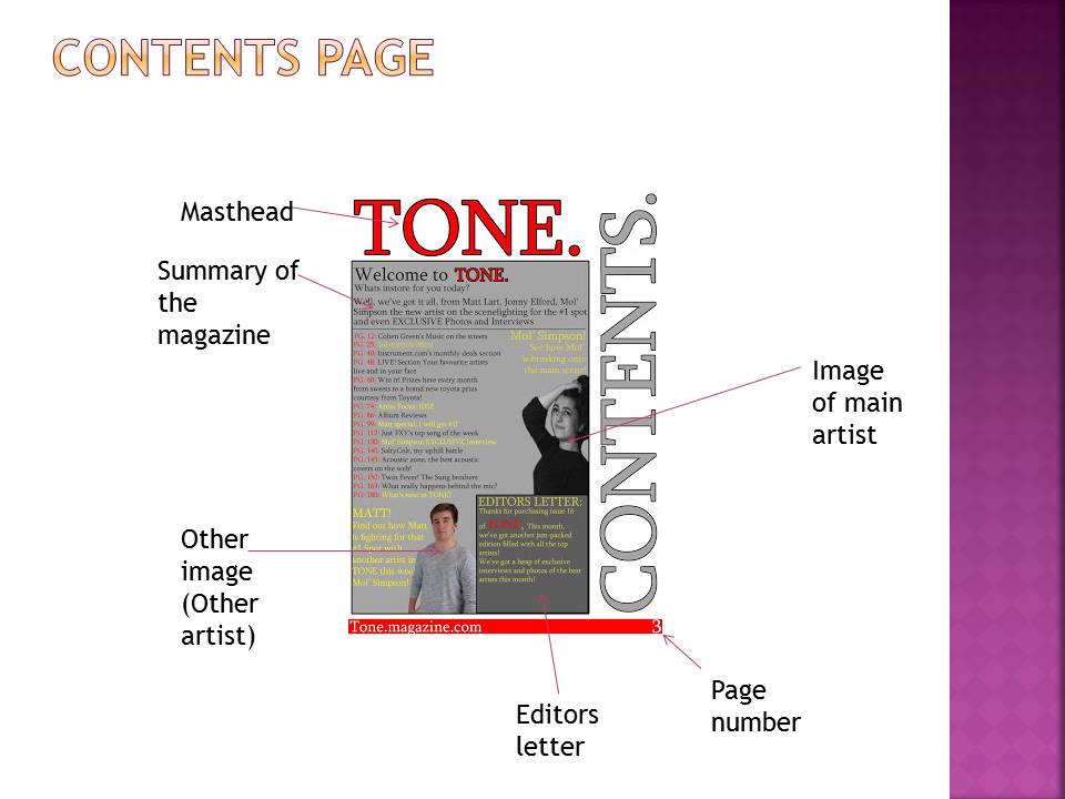
 My contents page looks fairly bland in my opinion, but its structure is good, I will change the colours slightly but keep the structure. I kept the red bar at the bottom, but made it slightly shorter to accompany the 'Contents'. The subtitle after "Welcome to Tone." also blends in, so I could possibly make the names of the artists in red to attract attention to them. I will also use an original image for the photo of Matt, as I used a photo from Facebook for the current one, (with permission). The new photo will also have his whole head. I will also get a photo of him playing a guitar. Which I will also change the opacity. I like the way I kept the same style for the "Contents" the same as for my title. I will also remove the white rectangle behind the page number.


My double page spread I feel came out the best out of the three pieces. I feel I will keep a lot of the aspects of this. I like the red bar at the bottom which I have kept on all of my pieces. I will get a far better image, possibly from a side-on angle. I like how I have implemented twitter, as I have noticed that successful magazines have engaged and included their readers. I like the title, but I feel it could be more centralized to draw more attention to it, and I also need to include a quotation from my artist. I will also move the questions to follow the outline of my image.


Colour scheme ideas, Name ideas and feature story ideas


Colour Schemes

I have been researching successful colour swatches from other magazines and have found that they all have a select few colours. These are usually very bold colours as they stand out on the shelves. Colours such as red, blue and yellow are used often, these are primary colours so will be recognized by a lot of people at a far distance and will also attract them from a distance too.

My first colour scheme utilities blue and red, with red being the main colour. as they are colours used in other magazines. I like this scheme the most and I feel will look quite good as the bold red suits the blue.
I think I will use this scheme as my colour scheme for my magazine.


My second colour scheme uses a triad method, where three colours are used. I feel this is my second favorite scheme however, I'm not a huge fan of the yellow. I think I like this scheme because it uses the red and blue of the first scheme.


 My least favorite color scheme uses yellow and purple as they are opposing colours on the colour wheel. In my opinion it doesn't stand out as much as the first two.


Name ideas: 
I have chosen several names I feel are suitable for by product.

  • Tone
  • Tune
  • Beat
  • Cena
  • Unplugged
  • Vocal
  • Sharp
  • Awake
  • Hyped
  • Mic.
  • Window
  • Hustle
  • Loyalty
  • Respect 
I feel that they are all suitable, however, I feel that Tone, Sharp and Beat are the most appealing. As they are short and snappy, They also have very sharp sounds in them, making them sound bold. I have decided to choose "Tone" as my name as it is simple and also got the most positive comments when I asked my peers for their opinions. 


Cover Story Ideas
I have looked at several covers of successful magazines and noticed that the cover stories are usually short and brief and have a smaller piece of text underneath them to also engage and attract the reader to purchase the magazine. They follow the genre of music and often has a bit of relevance to the world at that moment in time, for example, a new album or song being released. Here are a few ideas for main cover stories:
  • For my main cover, I will have one artist, so they could be possibly trying to get the number one spot on the charts
  • Another idea is that they might have just released an album. 
I feel that the first ones will be the most appealing for my audience. 

Next I will have a few other, smaller cover stories. 
  • An artist releasing a single, 
  • Possibly a "Live Music" section. 
  • A competition.
  • A writers top songs?
  • Interviews 
  • Photos
  • "Gossip"
I feel that the first four would be the best, and the last few could be implemented on the contents or in a different section on the cover. 

Costume designs


Costume Ideas:
I have chosen these outfits because I wanted primarily my artist to be relatable to the audience. 
My first outfit is one that 'normal' people would wear casually. It is also what people who listen to it would wear, and make the artist relatable
My second outfit is similar to the first and is also relatable to the audience.
However, the third is more of a formal attire and shows that the person in the main image is important, because they're in a suit.
 
 
Idea changes, and how I have adapted this:
Due to my complete overhaul of my idea, I have chosen to take photos of a different person. This means that I must re-do my costume ideas to suit a female, as the new person is female.